
TOYOTA
DEALER DAILY 365
Role : UX Design & Web Design
Quick summary
The Toyota Dealer Daily communication portal helps dealers spend less time at their computers and more time selling vehicles. It lets them order parts, download sales information, company information, gives training, file warranty claims, manage financing and insurance for customers online and post critical messages. It has been doing this since 2002.
The brief was to design the new dealer portal called Dealer Daily 365 to further increase it’s efficiency.
The Approach
On first glance the portal seemed quite cumbersome and hectic to the eye of even a trained user.
Not surprisingly the Toyota representatives mentioned things like “not easy to find stuff ”….”filtering out entities is cumbersome ”…”when I joined I had a hard time figuring out the system ”
Doing a heuristic analysis would have given some visually obvious results. I thereby decided to approach the solution from scratch : Persona study > User journey > Experience direction > Design Vision.
Since this was an UX exercise for a proposal response I presented the solution considering only one persona due to the time constraints.

John - Parts Manager
The main users of Dealer Daily are dealers, parts manager, sales managers and insurance representatives.
I looked into the life of the John ( parts and inventory manager ) as he had majority daily interactions with the portal.
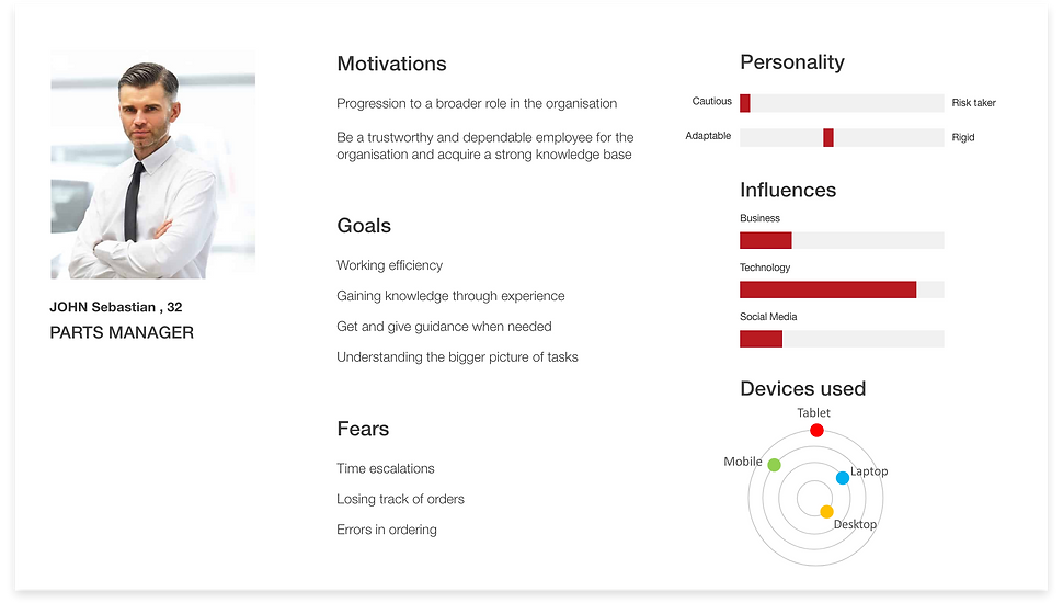
John’s Day
Deep dived into John’s daily tasks and was able to understand where the present portal was lacking both at the micro level (eg : part knowledge) and macro level (eg : information arrangement).
I was able to derive a direction to improve the efficiency.

Direction
Simple
Fast
Proactive
Visual
Personalised
Minimal
Design points
Easier way to find and navigate through information
Information arrangement to meet main tasks
Faster completion of tasks
Clear layouts for less cognitive load
Modern design for enhanced experience
Quick Sketches
Rough sketches helped in realising the direction. A flexible dynamic tile based approach seemed an optimum layout for the requirements.
While sketching the intent was to have minimum main components on the screens, focused at tasks assigned to John.
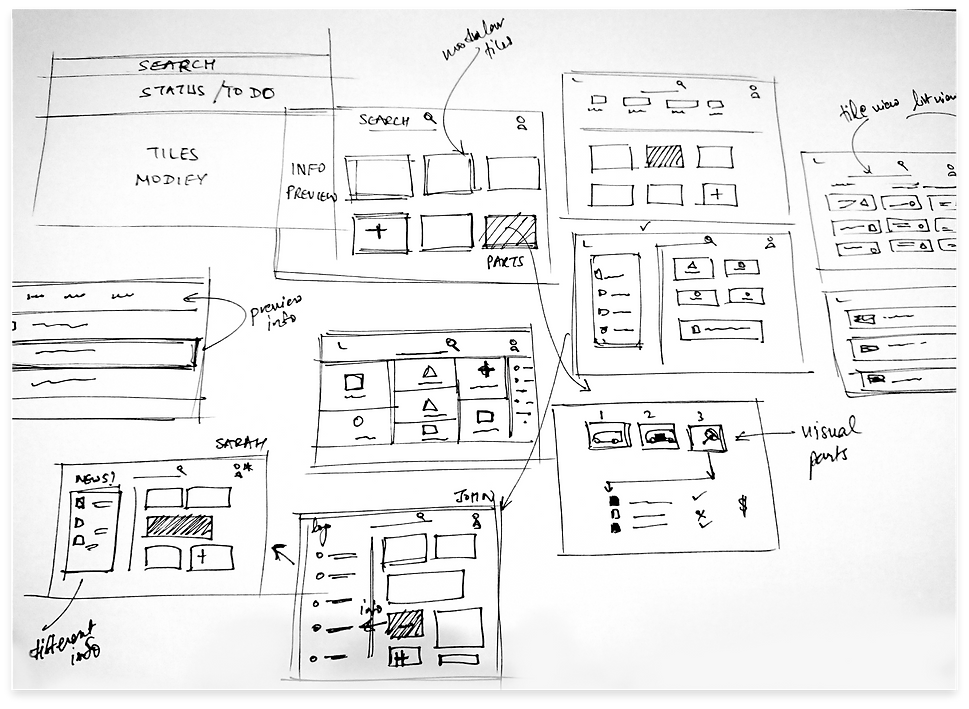
Design
Options
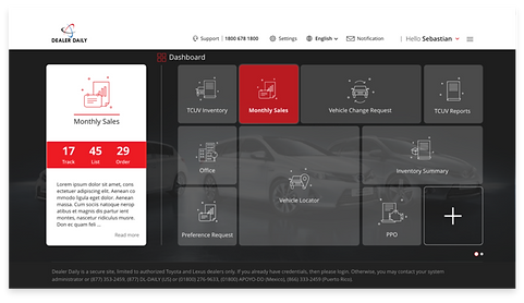


Highlights
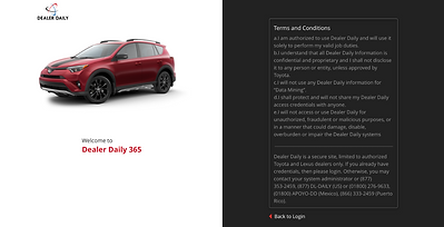
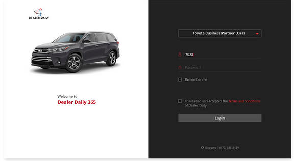
Login
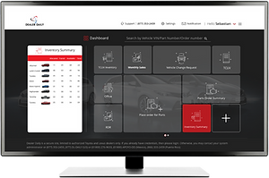
Explored some home dashboard options to set the tone for the rest of the flow, went with the first one as it was functional for view and actions.

Homepage
Broad quick search for faster checks and personalised with modular tiles.
Dynamic hovering previews for quick access to information and efficient completion of tasks.
eg: the parts manager can directly order parts from the tiles and also see the status of the ordered ones.
Parts
Clear layout of information.
Flexible search using part name or part number and refined filters helping in faster information access.
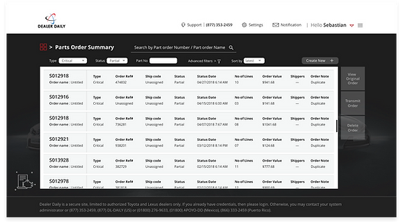

Usage of images/icons, color clues to guide the user.
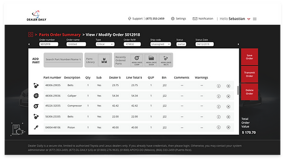
Part order screen
Flexibility to find and choose the part based on the knowledge level and convenience...

..by using part number or part name
…or using a parts library if user wants to use system level understanding.

View for the other roles


Personalised and proactive role and usage based information previews and action tiles.


Different view (list or tile) options providing flexibility.
Judicious use of space : details are added to next line of the list avoiding horizontal navigation.
Effecient
Impact : the user centric approach to provide the vision gave capability demonstration to get in many projects
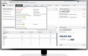
Complex
Simple
New : Simpler to use with increased
efficiency and delight
Functional
Present : Capable but complex, requires
knowledge and skills to perform tasks that are developed over a period of time